Effective web design begins with business goals. It starts by understanding the business challenges. By addressing consumers' needs and aligning with strategy, we create a powerful tool for your business growth. Learn about our process or get in touch to discuss your project.
A selection of our projects...
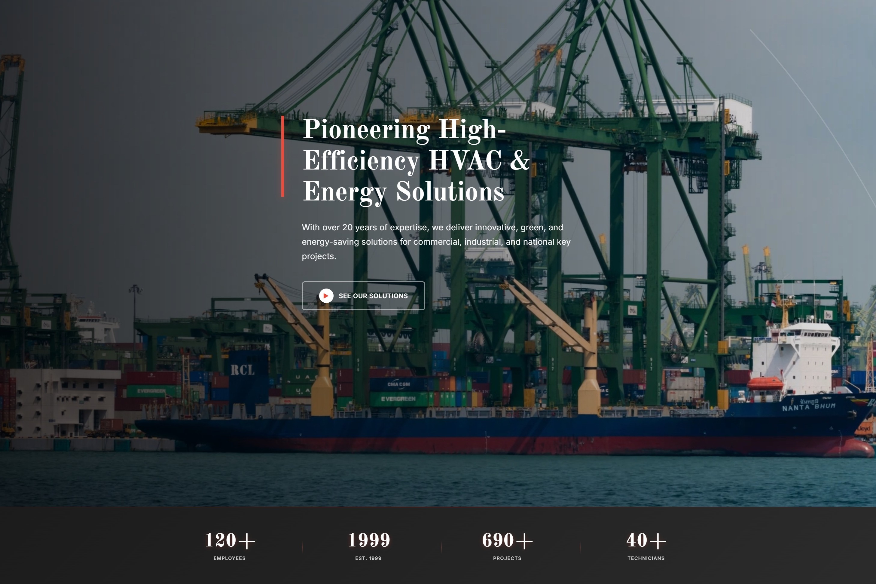
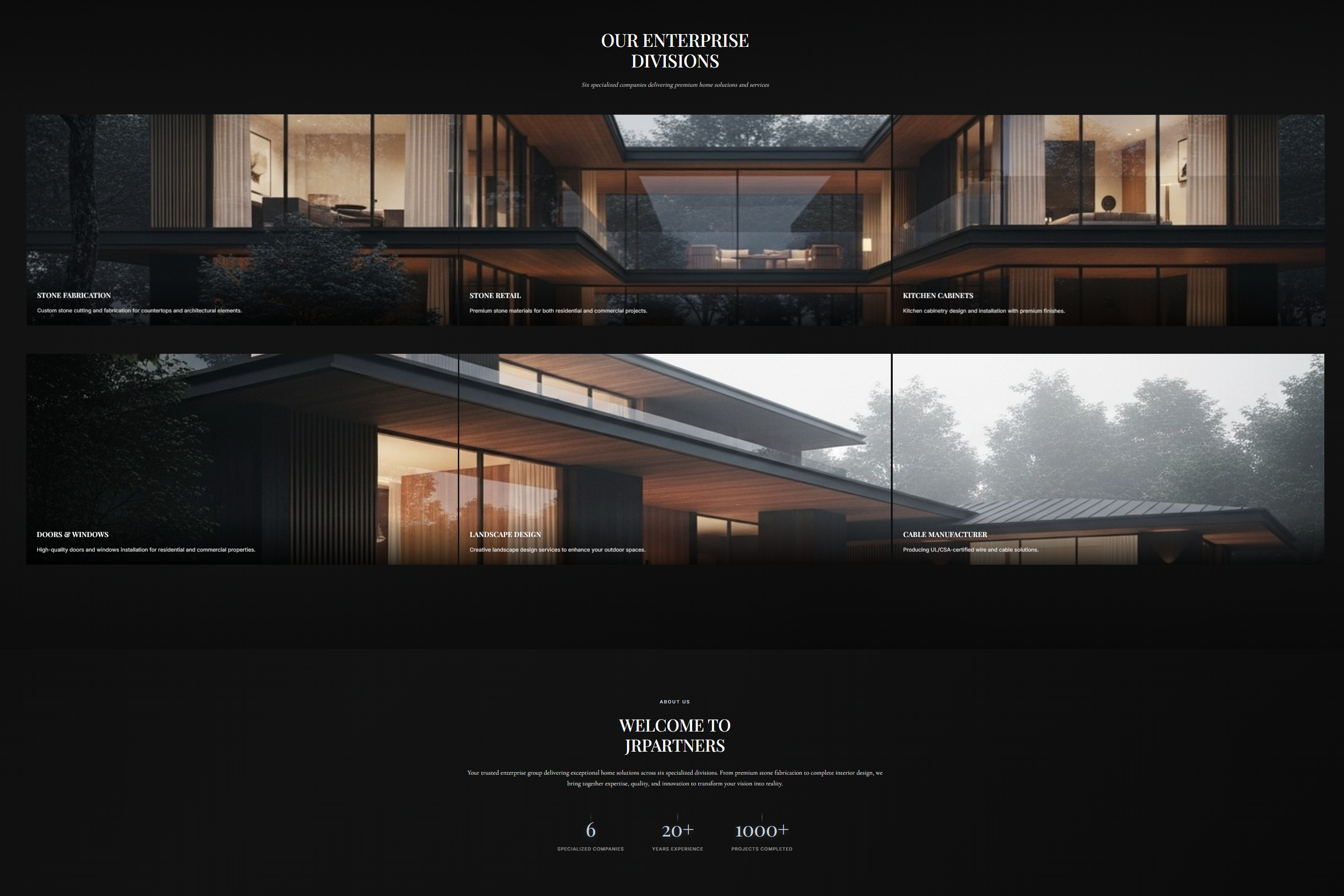
Industrial


Nonprofit
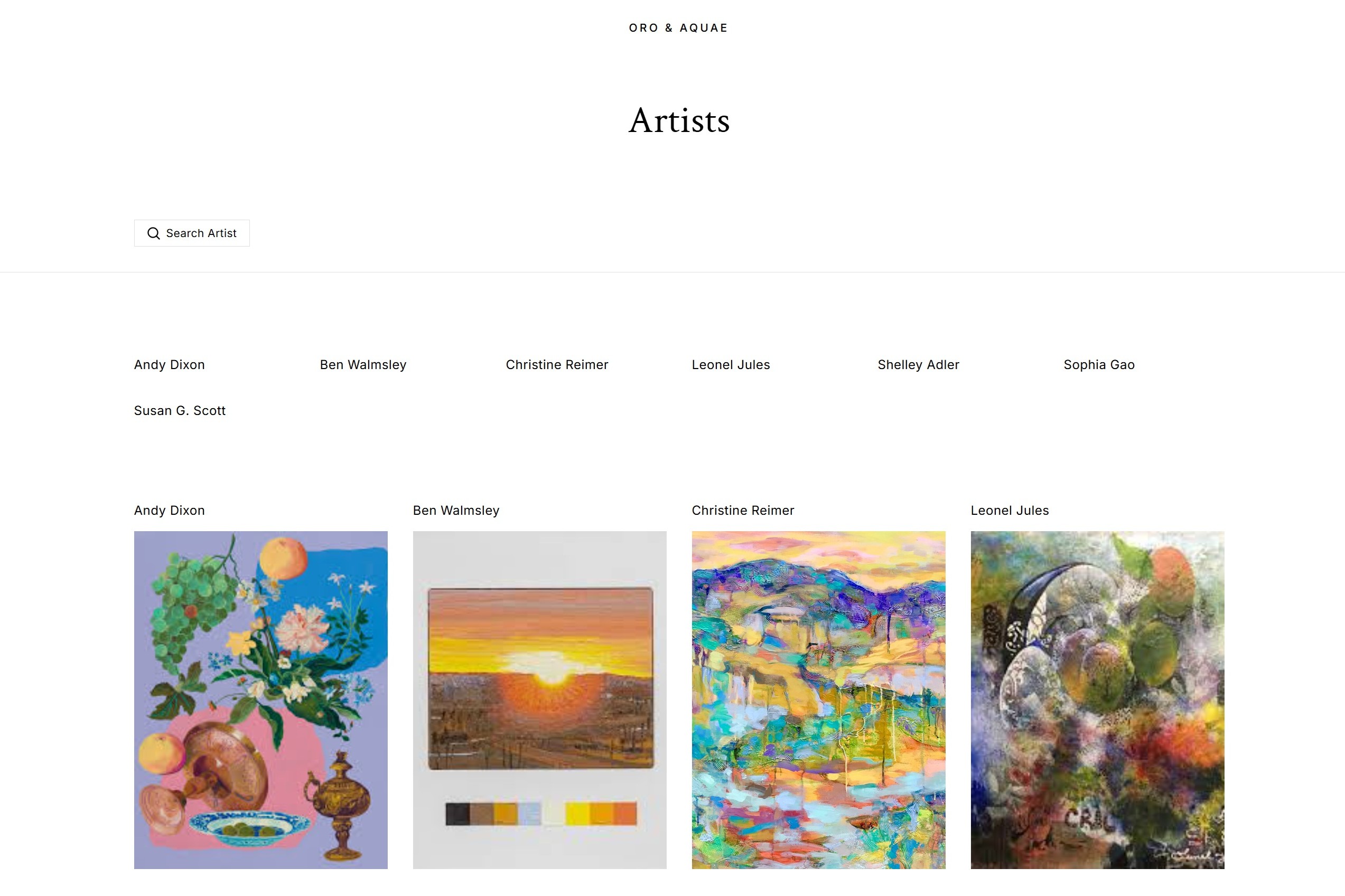
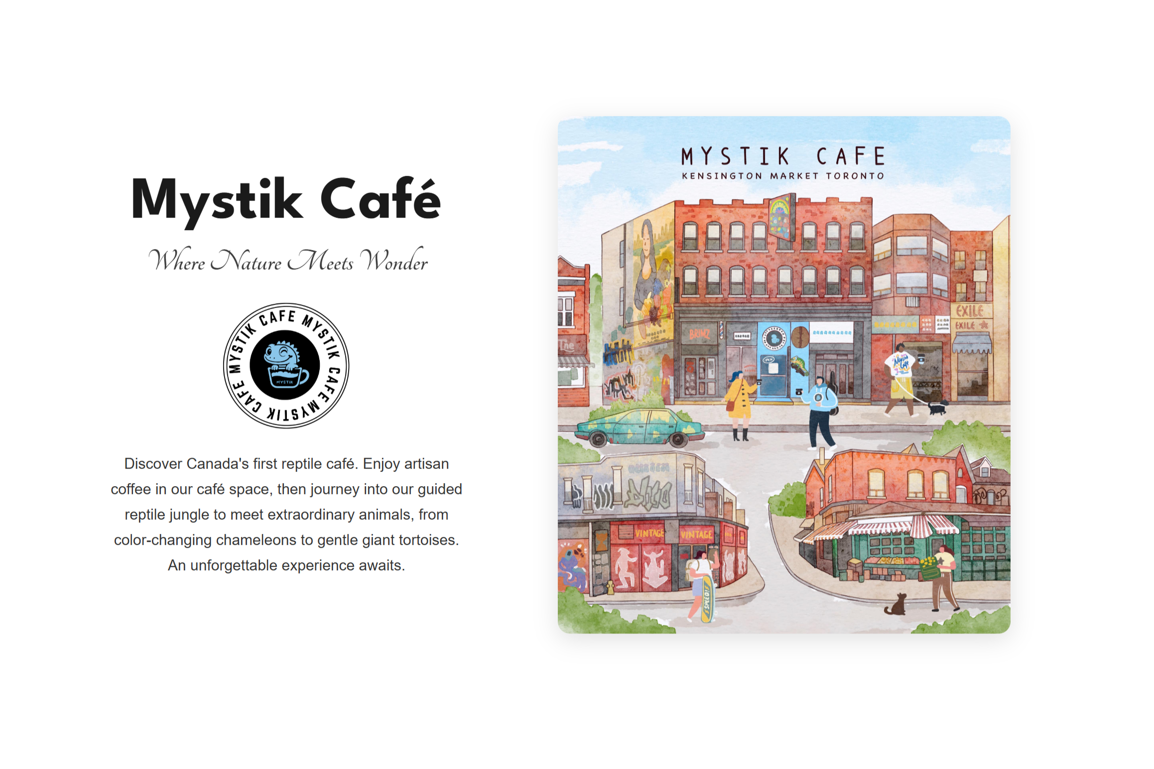
Art

Retail

Are You One of These Professionals?
You may qualify for our special promotional pricing starting at $499.
Home Inspectors
Roofing Contractors
HVAC Technicians
Residential Painters
Property Services
Plumbers
Mobile Auto Detailers
Paralegals
Immigration Consultants
Tutors
Psychotherapists
Private Investigators
Driving Instructors
Private Tour Guides
Limo Services
Aesthetic Medicine
Wedding Planners